


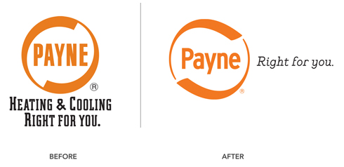
Not all logos need an overhaul. Some just need an update. Payne wanted a new brand look, but not at the expense of the equity established in their long-running logo. Changes most obvious were smoother, more directional lines and an upper-lowercase name treatment. Although the typeface is new, it remains in the san-serif, condensed family. The little things make a big difference too. The registered trademark is now scaled appropriately and in color. We also simplified the tagline and, given what it says, naturally moved it to the right of the mark, vs underneath.

